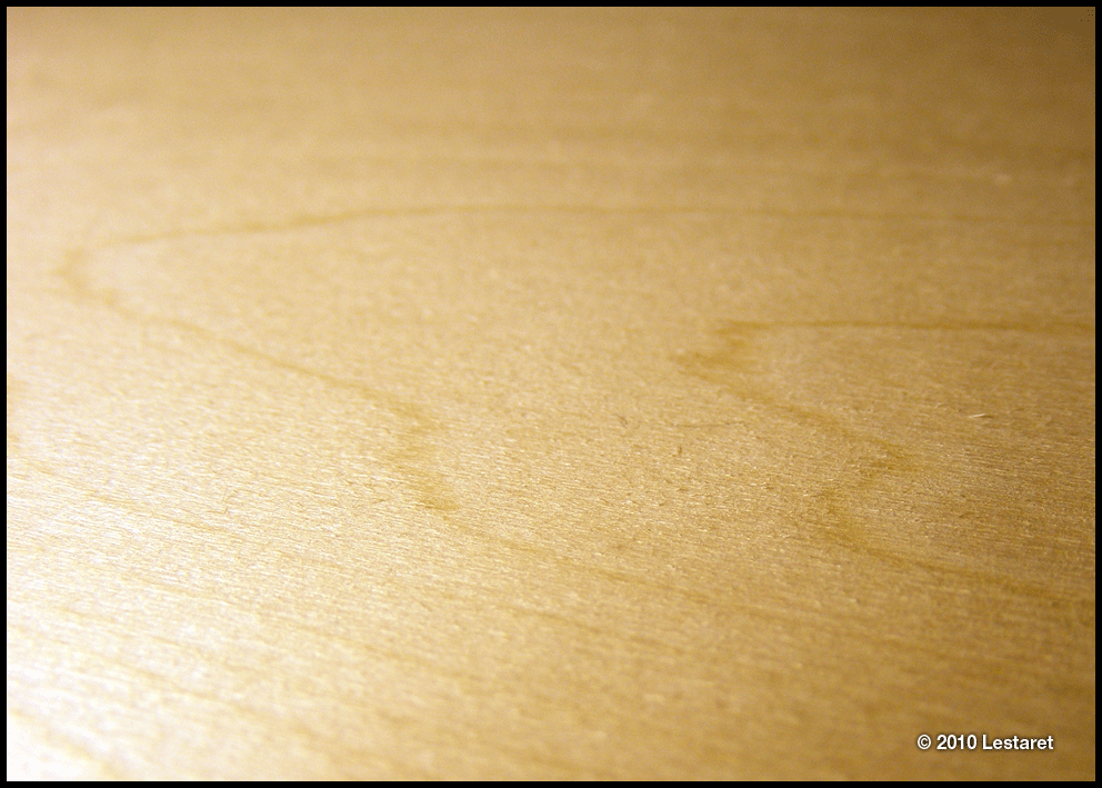
I bought a piece of Japanese plywood with the aim of experimenting with woodcut printing. I only bought a smallish piece, just larger than A2 to practice with but have not done anything with it so far. It has a very smooth surface and is recommended as a starter block for beginners. (Probably because it is cheap!)
Having got a little fatigued with designing the circus poster I wrote about recently, I decided to ‘rest’ a little by doing a little woodcutting. What started off as a little trial ended up being much more complicated as usual. A very wordy typographic piece actually. Why can’t I be fixated upon amoeba or something similarly simple instead of letterforms?
I have a whole file of quotes, quips, excerpts and bon mots, usually about design, typography, creativity and the like, and after an initial rummage I came across a wonderful statement by Beatrice Warde, an American typographer and academic originally typeset and printed in 1932 as a stand against the new modernist typographical styles and in defence of the power of printing. I immediately decided to use a non-classical font, something a bit more playful and unrestrained. The original was set in Eric Gill’s splendid Perpetua and is a fine example of what was considered as classical, civilised, refined and legible at the time. I even considered Comic Sans for a while, but decided that I couldn’t face it!
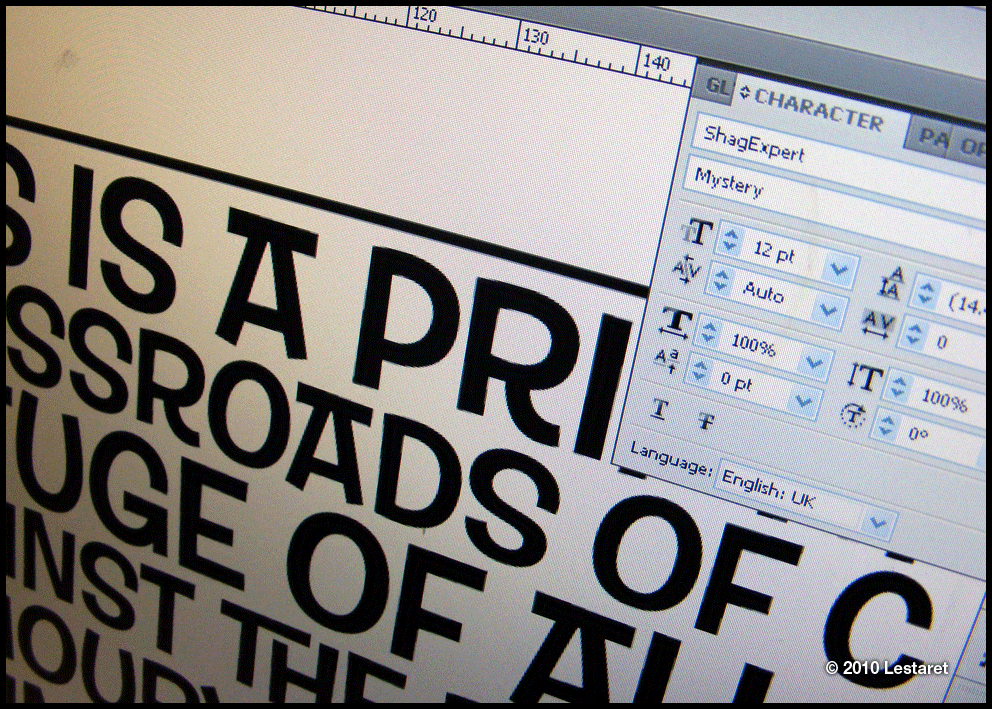
After a dig around some old font discs I came upon some 1960’s inspired stuff with all kinds of swashed pairs included. It seemed relatively simple too – no fine serifs and plenty of variations in line width etc.
A little while in Illustrator to get everything just right…
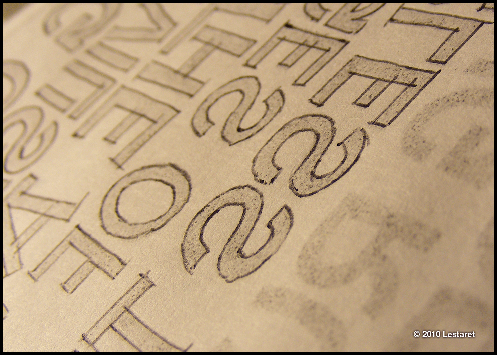
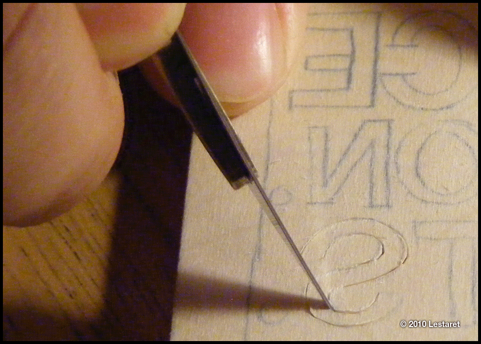
Followed by a trace using carbon paper…
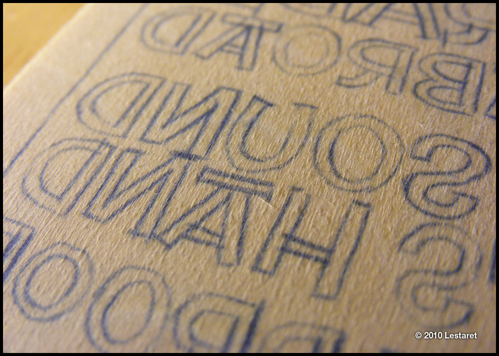
Leaving a reversed line version on the wood.
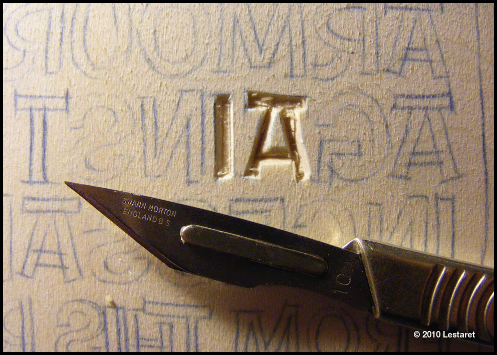
The entire piece was cut using 10A scalpels. I used almost 5 packs in total!
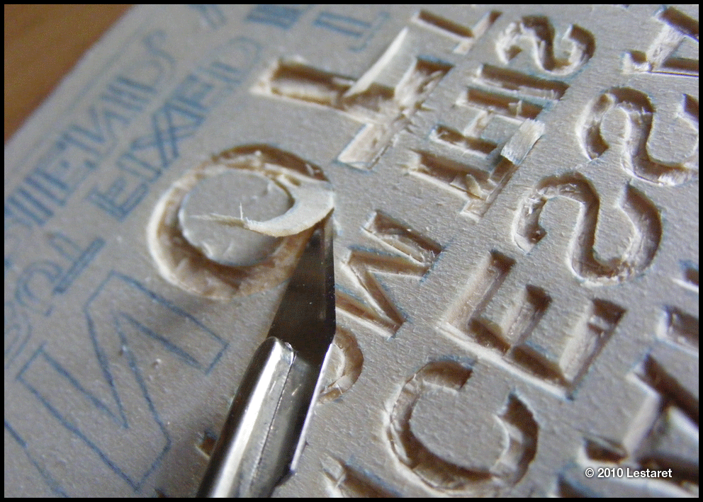
Each letter was traced and the inner parts were removed by ‘digging’ out with either the scalpel or an awl.
After the first couple of lines I realised that I’d given myself a larger task than I’d originally planned!
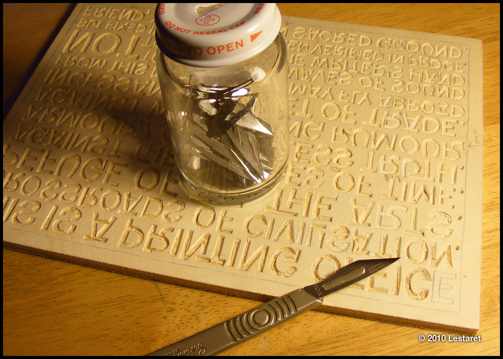
This is the point where I had one more letter to cut. The jar contains all my used blades…
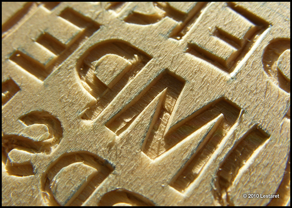
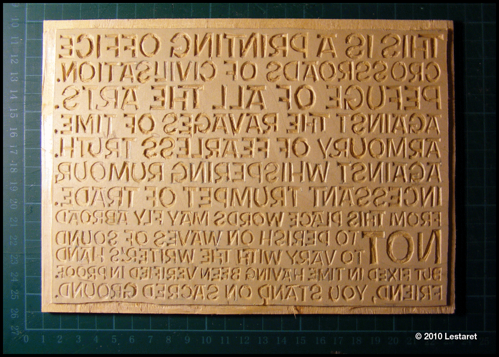
And here is the finished block. Well, I say finished, but there are a few little nicks that need filling before I go to print. Also, I’ve just noticed that I missed the leg of the R at the beginning (right hand side) of the third line down. I’ll do that too.
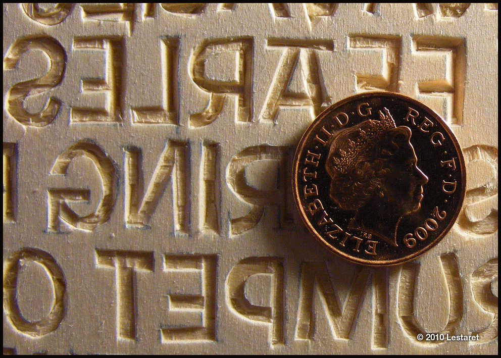
And finally, a shot of the block with a penny to show scale. Printing tomorrow!

Hello, nice work, how difficult is the wood cutting?
I wonder if you can help me, I’m currently doing a project that involves designing a vacuum cleaner, I’ve gone down the route of a 1920s/30s style, it is going to be clockwork powered, just curious if you could recommend a suitable typeface for me to use on presentation boards? Preferably one that is easy to read from a slight distance away. I don’t mind paying for one (if its not too much that is!)
Thanks.
The actual cutting of the wood is easy, but you have to be careful not to split the top ply. I have been advised to try MDF too. That’s for another time…
See the comments Christian made below about typefaces, but also do a little research on art deco posters to get an idea of graphic styles and colours too try these flickr groups: http://www.flickr.com/groups/659012@N23/
Wonderful.
Using your hands with some wood and a blade, you can see how much fun that would be.
I know, and I didn’t cut myself once!
Fantastic work Chris! I love this – really great Shag style. I hope this is going in to your shop section. I know many designers / studios who would proudly display this on their walls. Everyone likes the hand cut approach. Real lo-fi / music poster styling. Do you see the Tom Waits posters going this way?
Matt Shiggins –
Try looking at House Industries (http://www.houseind.com/) for some cool vintage shapes. Plus Myfonts.com – always a good starting point (and useful search functions). Both offer good reference.
Cheers Christian. I hope the prints woill be good enough to put out for sale, I will know later as I am printing tonight… expect some images to follow!
As for the Waits posters, I guess they will loosen up in the cutting, but at the moment, everything is sharp and vector clean. I intend to do this a lino cut so that will dictate how much detail and accuracy is retained. as you know, I too like the hand cut feel so I’m sure that I might be close to meeting your expectations…
As I mentioned in the post, I have grown a little weary of the poster, and want to tackle the completion of the design and subsequent cutting with a fresh pair of eyes. I will probably pick it up again next month after I’ve completed another CD design project and some more publicty for the Jon Lawrence album. Busy busy!
Excellent work, Christian!
About how long did it take to finish the carving? I hope the print turns out great for you, would love to own one!
Cheers!
I have spent about 12 hours over 3 days cutting the block. Although that is not a great deal of time, I am still very sore around the shoulders and neck as you find yourself hunched over the block – which becomes more of a problem when you’re driving! Something for me to think about before starting the Waits/Circus poster!
I’m going to revisit the printing of this block again and try to get a decent enough quality to distribute – you can have one if they’re good enough!
Thanks for your interest Bruce.
Liked this site very much – and the
illustrated process of making your
woodblock.