Asemic

New Asemic Work

utsanga-logo
I have just had some new asemic pieces published on the Italian website UTSANGA. There are several other asemic artists featured in this issue too, and you’ll find even more in past issues.

It is definitely an interesting place to explore with a rich mix of multinational content which bills itself as “… a magazine of critical languages and research, look at the dynamics and challenges of the global literary scene, the mingling of languages, the different facets of language research.”

Go there, stay a while, and tell them I said Hi.

Asemic

A Kick In The Eye

It was way back in February 2012 when I received an email from Tim Gaze (the publisher of Asemic Magazine, a publication dedicated to the presentation of asemic writing) inviting me to participate in an international collaborative asemic project. The only information given was that it was to be a “collaborative abstract visual novel, with no recognisable pictures & no legible words on any page.” That the intention was that 12 individuals would submit 12 pages, and we were all free to sample, edit and respond to each others images as they were submitted.

I said yes of course.

18 months later, after much work by fellow asemic artists across the globe, a goodly amount of editorial decision making and a not inconsiderable amount of design/layout/preparation, this week our baby is born – “A Kick In The Eye”

Digital Camera

A KICK IN THE EYE spread 1A KICK IN THE EYE spread 2

My fellow collaborators, along with Tim Gaze (Australia), are: Orchid Tierney (New Zealand), Rosaire Appel (USA), Tony Burhouse (UK), Marco Giovenale (Italy), Gareth A Hopkins (UK), Satu Kaikkonen (Finland), Gary J Shipley (UK), Lin Tarczynski (USA), Sergio Uzal (Argentina) and Nico Vassilakis (USA)
A KICK IN THE EYE spread 3
At this point I would like to point out that the cover image was submitted by Gary J. Shipley as one of his 12 images. For me, this was the cover right from the start, although I did explore a few others. This one needed no clever graphics but gave the cover a chance to communicate something vague, possibly recognisable, but somehow elusive. which lent itself to visually voice what we had created between the covers. Great image Gary; I wish I’d done it.

Gary-Shipley-Cover-Image
© Gary J Shipley

A KICK IN THE EYE spread 4  A KICK IN THE EYE spread 5A KICK IN THE EYE spread 6
As you can see from these few spreads, there is a wide variety of creative approaches, resulting in an eclectic, but coherent volume of stimulating imagery that is ready for individual interpretation.

This unique and exciting book comes in at an impressive 150 pages and is in US Letter format (8.5 by 11 inches/215.9 mm x 279.4 mm – a bit shorter but wider than A4) and available through Amazon at an incredibly low price.

Go there now and buy one for yourself. Whilst you’re there, buy another for someone you love too. Leave a review if you feel that way inclined.

Thankyou. And thanks to Tim and all my fellow collaborators too.

Asemic

Underovary

LESTARET-underovary-1
Ladies and Gentlemen of the Worldwide Internetland, I am proud to present the third book in my asemic novel series;

LESTARET-underovary-5

Those who read this blog regularly will know that this book features entirely an entirely new script, created specifically for this book and with stages of its development shared on this blog.

LESTARET-underovary-2
This book aims to build upon the notional narratives already begun in Four Fools (2011) and Pabulum (2012), directing to the reader beyond the confines of the written word and into the realms of their own philological dexterity.
LESTARET-underovary-3
The book features an array of calligraphic glyphs and print compositions amongst more conventional compositions, along with some unusual applications and striking juxtapositions.

Underovary is published through those fine folks over at Blurb, along with Four Fools and Pabulum.

Asemic

Further Fools

LESTARET-four-fools LESTARET-pabulum LESTARET-book-3
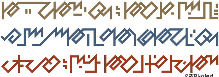
After many months of feverish activity, the third installment of my asemic novel is nearing completion. It has been hard work. Difficult sometimes but not unenjoyable though. This book has emerged, blossomed and bloomed during a very difficult period in my life, which has brought many other creative endeavours to an abrupt halt. For this reason it feels that bit more special to me.

I have posted a few pieces on the early stages of development of the new script for this book and shown far more of the process that I had done previously. This has generated some very positive feedback along the way and has, at times, been a valuable source of motivation during periods of doubt, depression or general creative malaise. Thank you.

LESTARET--textile
The contents are done. Final pagination is underway. The technical process of putting a book together has begun – I have a title and a cover too. This stage can feel very indulgent at times. As a graphic designer I am not afraid to let anyone know that I get a good kick out of the technical aspect of the production stage, but with this one I feel that there is a greater impulse to ‘get things right’ in regard to the juxtaposition of content. In this I am very aware that every decision I make can potentially jeopardise the balance previously established and threaten both the totality of the book and its place as the third piece of a planned four.

I am regularly frustrated with myself when I am indecisive or stubborn in my design decisions, and employ a variety of reflective though processes to analyse the consequences of each step. This approach is sometimes more problematic than helpful, particularly in times when personal confidence is compromised. That said, I am not always afraid to trust my judgments, even when previous analysis suggest that I may well be wrong. Experience? Intuition? Instinct? Yes to all three.

This when the objective/subjective argument kicks in; can I be an effective creator and editor at the same time? Well, yes – to a point – the years of experience in design decision making and teaching have allowed me to develop the ability to stand outside of my own preferences in order to make judgements in a variety of situations. And then there is the ‘no’ part – it is impossible to achieve total detachment from yourself. So how does this work?

When it comes to personally led work, it is easy to indulge oneself completely. Self publishing (which used to be called vanity publishing) is, in itself, an indulgence – I don’t fool myself that it is anything other than this. It is, however, a practical method of producing specialist books ‘on demand’ to very limited audiences though, and quite cheap too, which is not something that can be overlooked. These books, for me, are initiated by my own personal vision of what I wish them to be, but once the content has been completed, I can really begin to think about the work on a whole new level; what would I want to see if I were the purchaser?

This approach allows me to explore the content I have produced in a different way than the process I used to create it and juxtapose imagery out of the synch in which it was developed. This inevitably leads to new ideas, developments within the artwork, and occasionally a very harsh cull. There is a heck of a lot of material that never makes it to the book. These are sometime discarded, but often resurface in other projects at other times. But now I’m rambling!

I guess I just wanted to let you know that the new book is almost ready and I’m really proud of it. Not long now.

Asemic

New Asemic Work

altered-scale
A while ago I was invited to submit some new asemic pieces by Marco Giovenale who was guest curating a new section in AlteredScale.com – an online publication “at the intersections of music with writing, performance and visual arts.”

At the time, I had been giving the new asemic script a lot of attention and thought that some other explorations would be a useful way to step back from the systematic development process and go back to a more intuitive approach. This resulted in nine new calligraphic works, five of which are being published exclusively at AlteredScale.com

There are a couple more new pieces on foffof too:
foffof

and another two on i’m an artist man:
artist-man

Asemic

Hot Off The Press!

anthology-book

“An Anthology of Asemic Handwriting is the first book-length publication to collect the work of a community of writers on the edges of illegibility. Asemic writing is a galaxy-sized style of writing, which is everywhere yet remains largely unknown. For human observers, asemic writing may appear as lightning from a storm, a crack in the sidewalk, or the tail of a comet. But despite these observations, asemic writing is not everything: it is just an essential component, a newborn supernova dropped from a calligrapher’s hand. Asemic writing is simultaneously communicating with the past and the future of writing, from the earliest undeciphered writing systems to the xenolinguistics of the stars; it follows a peregrination from the preliterate, beyond the verbal, finally ending in a postliterate condition in which visual language has superseded words. An Anthology of Asemic Handwriting is compiled and edited by Tim Gaze from Asemic magazine and Michael Jacobson from The New Post-Literate blog.”

That is the official description anyway. If you have any interest at all in asemics this is a comprehensive collection of asemic practitioners from all over the globe, and well worth adding to your library.  Available to purchase direct from the publishers or via Amazon.

Oh, and if that’s not enough reason, I’m in it too!

Asemic

New Asemic Script #4

The script has been developed to a point where I can begin putting it into use, and I have been busy doing just that, with about half of the pages already completed for the new book.

I am now at a point where I need to expand on the script more, and explore some new avenues and structures. I had decided to see if the glyphs could be ‘unscripted’ and transformed into something more mechanical.

I began by losing all the curves and creating an angled geometric version:

lestaret-asemic-d43
This reminds me of decorated Ndebele houses, Navajo textiles and square Kufic script

lestaret-asemic-d44
I converted three lines to see how the various shapes translated and couldn’t help myself in applying them to a stone panel. Not really, just a little ‘photoshoppery’ to break up the line work I suppose:

lestaret-asemic-d45

I have not abandoned the hand drawn script script either. I recently purchased an automatic pen nib with a 15mm wide stroke and have been going freestyle with some loose gouache and ink…
lestaret-asemic-d46
I have also been working on some other, less restricted asemic artworks too, which will be published elsewhere a little later this year…
I also wanted to see if the script translated well to a geometric line that included circles and was very encouraged by the results:

lestaret-asemic-d47
So I spent a little time experimenting with slab serifs…

lestaret-asemic-d48
which put me in mind of an old favourite typeface from my college years; Lubalin Graph.

lestaret-asemic-d49
Designed by the legendary Herb Lubalin in 1974, I was fascinated by the inventiveness of the tight-spaced ligatures – something that I believe has never been digitized with the standard font!

lestaret-asemic-d50
If only my efforts were as well crafted! The slab serifs became turgid at smaller sizes (not shown), but the monoline version held up well. The next stage is to try some more…

lestaret-asemic-d52