
Tarry Flynn by Patrick Kavanagh
Disgrace by J.M. Coetzee

There is no friend as loyal as a book.
Ernest Hemingway
Ernest Hemingway
Tarry Flynn by Patrick Kavanagh
Disgrace by J.M. Coetzee

Chet Baker Live in Bologna by Chet Baker
Foxlight by Iarla Ó Lionáird
Can’t Stand The Rezillos by The Rezillos
The Very Best Of by Toots & the Maytals
Couleurs sur Paris by Nouvelle Vague
London 0 Hull 4 by The Housemartins
Dreamtime by The Cult
1897 by Seaworthy
The Prepared Piano by Hauschka
Systems/Layers by Rachel’s
Un Autre Décembre by Sylvain Chauveau
The Mix Up by The Beastie Boys
My playlists and reading lists have been a regular monthly post since I started blogging in 2009, and are probably the most personal information I include. The are occasional comments about my playlists – often from people who shared (or who have shared) similar tastes, and sometimes from people who are interested in finding different things to listen to. The playlist is not a definitive list of everything I have listened to that month, but the stuff I’ve played the most frequently or just enjoyed listening to. Selecting music to listen to is an integral part of how I work, and can influence what I do – directly and indirectly.
I used to think I had great taste in music, but as I have grown I tend to think that I just have a taste for music; I am more open and adventurous to new things, and enjoy being surprised at what I take in. So where does all this stuff come from? I use the web, I talk to people and take recommendations, but I also have a secret resource that is no longer going to be a secret; my brother has a more eclectic music collection and even more adventurous taste, and has been a steady supply of experimental and downright weird stuff for quite a few years.
He has decided to share his passion with the world and has an excellent blog which is rapidly expanding with reviews, recommendations, links and reports and I would like to shamelessly give it a plug here:

I like to think of myself as a responsible citizen, and do my best to reduce, re-use and recycle on a daily basis, including all the junk mail, and opened envelopes, but have recently begun to consider them as a more personal resource. I bought a paper making deckle and mould from a local craft shop, and picked up a second hand blender from a boot sale and set about making my own paper for printing on from all the stuff I put out for domestic recycling. I had made paper once before and enjoyed the process, but never really pursued it further than an experiment, so this time the aim was to make paper that I would could (and want to) print on. I made three batches during a weekend, using different mixes and got some very thin smooth grey sheets, some thicker digestive biscuit coloured sheets, and some textured whiter sheets:

These are all about A4 size, with beautiful deckle edges…

And a good variety of textures…

I have tried to get an accurate image of the digestive biscuit paper (not an elegant name, but apt) which was made from a few credit card offers, a parish newsletter, a bit of cardboard and a brown envelope or two. These were torn and shredded and left to soak in a bucket of water overnight, and then blended to pulp in batches. I didn’t photograph the process this time as it is a very wet process, so will enlist one of my children to official Lestaret photographer for the next batch. (That’ll cost me!)

A day to dry, and a day in the press, and I have a very tidy batch of handmade paper all ready to print on. And to think I used to hate junk mail – I am now actively collecting it, and even get excited when something particularly promising drops through the letterbox (even if it is a flyer for a greasy kebab shop!)
And I have printed on some of it, but I’ll save that for another post!

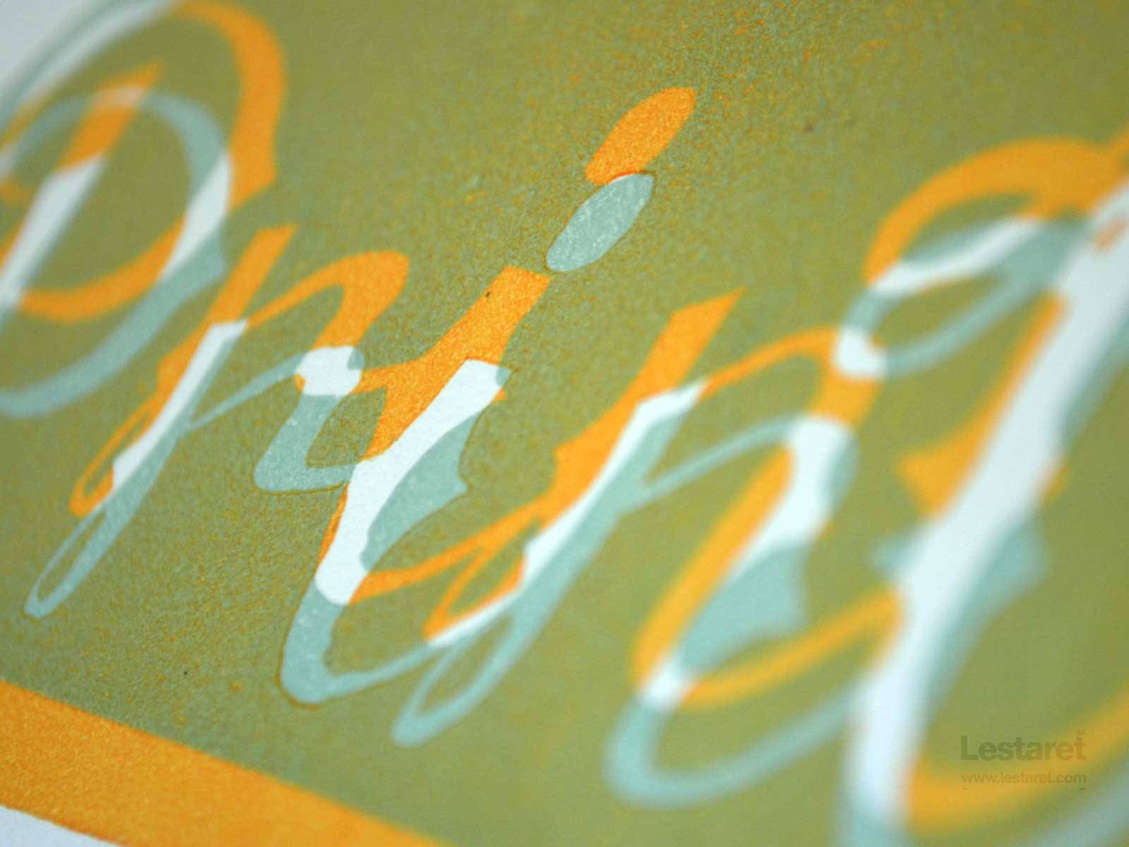
I have a very inviting pile of nicely printed postcards that are demanding to be overprinted. Again, I am experimenting with some new colours (for me) and aiming for a grungy/retro feel on each of the cards. I had printed a number of additional cards to use as set-ups as there is nothing definite when it comes to printing, and every stage has an opportunity for something to go awry.

Take this first print. this slimy effect is the result of a combination of things: a lot of transparent extender, too much ink mixed and rolled out on my inkslab and subsequently too much on the roller. The block is then over-inked which squishes out the excess under pressure and leaves this ‘beading’ effect. I also find that it takes two or three prints for the block to ‘come up to’ readiness – where the repetition of re-inking saturates the lino surface and rids it of any greasy residue, either from the carving (a very hands-on process) or more likely in this case, of any soap left over from cleaning (I use a little liquid soap and water for Caligo water based relief inks, and baby wipes to keep my fingers clean during printing.)

But after a few prints, the block settles down and I start to get the results I’m after. This is quite a rich orange, but because of the transparent extender, it looks metallic, almost gold on the block!

This image has been my wallpaper ever since!

This was about 98% extender and 2% black! I couldn’t get the transparency I wanted so I under inked the block instead.

And then it was on to some shitty brown over the baby blue…


If anyone else would like to enjoy some printy wallpaper, you can down load it here.

The unseasonally warm start to spring (although it has been followed by some fairly sharp ‘brass monkey’ weather) seems to have got my dander up in the printshop!

I run out a decent number of postcards using my trusty Belmont coppertop block and added a blog link in 10pt Gill Sans Italic. I ended up using the full stops from another font as the Gill was ‘sans punctuation.’ This has resulted in an unsightly drop on the baseline, but I decided to go with it as I thought it did not detract too much. (I can hear the sharp intake of breath from the purists and am girding my loins in anticipation of the responses this may draw!)

My aim on this project was to experiment with some new colours, combinations and effects, and began by mixing up some Opaque White with a dab of Prussian Plue and a tiny smidgen of Process Yellow:

I added just a little more yellow to push this towards a pale turquoise.

I am very pleased with this colour – it has covered well and laid down a rich base for the next stage. Oh, I had cut these blocks to try to develop my cutting skills. Sorry, no images of that part.

The next coulour was a soft pink, again using a base of the white with a dab of magenta.

Again, this has covered well and dressed up this blackletter a little…

I did want these prints to be clean – free from the lino ‘peaks’ – but thought these added something to the effect. I kept making small adjustments to the block to keep these to a minimum though.

The next block was printed in a baby peach colour, made from white, yellow and magenta.

This one has printed very clean and sharp as I intended.
There is also a fourth block, but I’ll save something for the end! With 40 cards all printed and stacked in my drying rack, I’ll let you know what is to come next; transparent colours.

Anyone who has been following this blog for a while will know that I tend to have quite a few things on the go. Most of them come to some sort of conclusion too, but some fall by the wayside, whilst others lay dormant until the right time, mood or opportunity presents itself. This is one of them. Way back in February 2010 I posted a teaser about a poster I was planning as a linocut project. I continued with it for some time, and got the design about 90% resolved on-screen, but got distracted with other things and put it to one side.

Whilst it was still a little too cold to print, I have been doing some nice, warm, indoorsy type stuff and mostly digital. This got me thinking about unfinished projects and led me back to the files I had last worked on a good year or so ago.

Having recently done a fair bit of linocutting and printing for the Leeds Print Festival, I wasn’t overly keen on a big lino job, and got to thinking about the screen printing I did in December. I didn’t blog about this at the time, as I was busy preparing lots of stuff for the festival, but I really enjoyed the process – not something I have been able to say in the past, but I got some really good results, and a lot more confidence with the equipment.

So I have begun to draw out the poster now. I have made some significant changes, and left quite a lot of detail out, so I can let the drawing evolve as I am working on it. I am intending to make this a tight registered 3 colour print, which is pretty ambitious considering how much experience have had so far, but what the hey!

I will continue to show this in progress, but will avoid showing the entire poster – I want to work up to a big finish!
More opportunities to play Mr.Wait’s Circus a little bit more…
There are problems in the UK employment market; I don’t need to tell anyone that. There are also problems in the creative industry, especially for graduates getting their foot in the door. Perhaps we ought to forget our obsessions with equality, recruitment policies and all such obstacles that are in the way of getting the right person in the right job.
I found this ad in a 1968 issue of GRAPHIS magazine.

No list of software to be fluent in, nothing ‘client-facing,’ no emerging technologies – not even the obligatory sense of humour required. No equal opportunities hogwash (and none needed) and no salary given. Refreshing isn’t it?
Can you imagine the brouhaha if this ad was placed today?
Dear Sirs,
Thank you for the recent opportunity to be interviewed for the position of Designer as advertised in the last issue of Graphis magazine, and your prompt notification of my failure to secure this post. There is, however, one issue that concerns me with regard to one of the criteria used in the selection process. Can it not be acceptable to be furnished with all of the required attributes and have a rather fetching manner of genius, brooding or otherwise?
Was I rated upon the aforementioned genius? If so, I demand that you reveal the scale on which this selection was decided upon. I made it quite clear on the Equal Opportunities Monitoring Questionnaire that I was of the Genius (Brooding, Mercurial or Aloof) persuasion and believe that if you were not fully paying proper attention when shortlisting, then that constitutes a serious breach of the Employment Recruitment Act (1985) which states that “persons should not be discriminated against on the grounds of race, sex, sexual orientation, age or creative temperament.”
You will, of course, be hearing from my solicitors (Messrs. Fingritt, Fawcett, Thrust & Co) and I will be selling my puerile story to any newspaper or low-brow magazine that will buy it.
Yours, etc.

Derek Twattermole,
Genius (Brooding)

The Lestaret Corporation has recently been granted a franchise on one of the divisions of Hell and as of May 2012 will be issuing tickets for the new system of entry (for a small administrative fee, of course.) This will involve standing in lots of queues, and the continual listenening to the entire output of Justin Bieber. Not big changes then.
Just to demonstrate the levels of intense toil that goes into producing each ticket, here is a quick overview:

1. Taking reference from a classic format, all measurements were accurately taken.
2. A batch of sturdy card was trimmed to an oversized dimension (10mm all round,) for better handling during printing.
3. A template was created in order to gain an accurate position of the print. The centre was trimmed to show the maximum print area and used to overlay the makeready prints.
4. Printing. Well, not quite that simple. First the type needs composing – Univers 45 and 68 centrally aligned – this took around 45 minutes in all, particularly in the positioning of the type in the chase. This was then printed on the Adana 5/3 in a dark green. A day later, the numbering box was installed and the tickets were sequentially numbered in a deep red.
5. The top and bottom are then trimmed. I set up a temporary jig on my cutting mat to speed this up.
6. The tickets were then perforated using a small perforating wheel bought from a local craft store. Again, a temporary jig was used for this process.
7. Holes were punched with a hand held single hole puncher, using a cardboard jig to ensure consistency of position.
8. Edges removed to enhance the reveal the ticket!
This is a lot of effort for such a small bit of ‘stuff’ but I like it!

Riceyman Steps by Arnold Bennett
Down Under by Bill Bryson

Black Mill Tapes Volumes 1 & 2
by Pye Corner Audio Transcription Services
Manhattan research, Inc by Raymond Scott
The Köner Experiment by Experimental Audio Research
Des plumes dans la tête by Sylvain Chauveau
Real Gone by Tom Waits
My Shit Is Perfect by Bob Log III
Intrigue & Stuff by Leyland Kirby
Badlands by Dirty Beaches
Clockwork Orange OST by Wendy Carlos
Right At Your Door OST by Tom and Andy
Dead Man OST by Neil Young

